At the beginning of each month I will be showcasing a photo gallery displaying the original photo and the subsequent editions that have been done. There will be a linky tool available for anyone who would like to join in the fun. The event will begin here the first day of each month and continue until the last day of the month. I believe that there are a lot of creative photographers out there and I for one, would love to see your work.
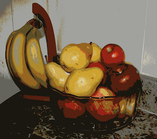
This month, my subject is a simple bowl of fruit with a horrible, distracting background.
As you can see, my biggest challenge will be to take the emphasis off of the distracting, white wall. So, here goes...
#1 A simple crop using a Pencil Sketch edit. No frame on this photo.

#2 Simple crop using Posterize Edit. I chose 29 color options with 96% detail. 0% fade. Again, no frame.
#3 Is a combination of edits. I began with the simple crop and a Hypnotic edit with original settings and 0% fade. I continued with Lomo-ish edit at 50% edges and 0% fade.
I touched this photo off with a Mirrored Frame at 100 thickness, 75% polish, 20% shadow and a cream tint.
#4 After the simple crop, I used the HSL Filter edit with hue set at 180, saturation at 26.35,
lightness at -11.85, and 0% fade. In the same edit, I chose the advanced mode of 'Subtract' which removed the white background. I then edited with Panography-ish using variation-1, 10% kookiness, and 60% photo opacity. Framing would have taken away from this edit.
#5 This is a simple crop using the Adjustable Threshold edit at Normal. Then applied the HDR-ish edit with a 20-Radius, 200% Strength, and 0% fade. For a frame, I used a Polaroid with a 7" rotation.
#6 The one thing I really enjoy about editing programs is that it allows your imagination to run wild and develop images that you would never see in real life.
Cropping again and then heading to the Neon edit, I designed this image using a dark peach color with 10% fade, drawing in more detail in the fruit and countertop. I used the 'Border' frame with a black outer frame at 73-thickness and a white inner frame with a 53-thickness. Zero corner radius.
#7 One of my favorite edits is the CinemaScope although it doesn't work well on all photos.
With this one, I cropped the original, and then Softened at a 50% softness and a 50% fade. I then added the Lomo-ish edit with 50% blur edged and 0% fade. The final edit is the CinemaScope as a framing feature.
Editing photos can take a blah, ordinary photo that has little attraction and turn it into something unique and/or unusual that offers more to the human eye.
Looking forward to see your creative edits this month!


